![]()
I’ve been posting a bunch recently, and I’d kind of like my bold statements about the uniqueness of story design within game development to stay near the top of the blog a little while longer.
But Valve, damn their tardy-but-impeccably-engineered brilliance, have gone and unleashed a closed beta of a brand new Steam Mobile app for iPhone, and probably iPod and iPad. In fact, hell, I just checked the press release and it says ‘iOS and Android devices’, so even Google gets some love.
Being an acclaimed Steamophile myself, I pounced on the free download and subsequently received my invite to the Beta. If you want to get into the Beta: try to log in via the app first; type in the Steam Guard code it just sent to your email; it’ll tell you you’re not in the Beta, but you’re added to the waiting Beta list; wait a day then log into Steam on your desktop and look for a new item in your Steam Inventory. If it’s a Beta invite, you’re set.
For some reason, I seem to think that the best way to show how cool I am is by geeking out over the latest and greatest from Steam. This is manifestly a dumb life policy. That said, here’s my pocket review and first impressions!

Like FaceBook
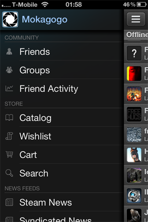
If you like the new layout of the FaceBook iPhone app, you’ll dig the Steam one. Personally, I don’t, but I’m not holding it against them. They have that whole menu-pops-out-from-the-side thing going on. It does make lots of areas quickly accessible, at least… Or DOES IT?
Navigation
Getting out of a page deep in the app — for instance, the item basket — and all the way back to the main menu is a bitch. It is only possible by tabbing through however many nested pages you’ve gone through to get there, with no obvious shortcut. * [see the comments]
Another slight irritation is that if you go out to the menu and then want to return to your Friends list (the default main page), you can’t just tap anywhere on the Friends list screen, which is mostly panned off to one side but still visible… You have to tap precisely on the top-left button that you tapped on to pull up the menu. Valve should take a lesson from FaceBook’s UI, and fix that.

Chat
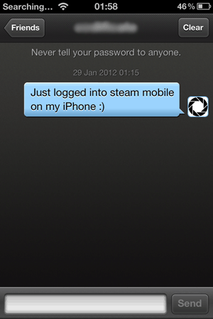
Your friends list is there, complete with chat ability, their in-game status, link to their Steam profile page, which itself contains recently played, wishlist, screenshots, videos — basically an overload of info. You can even delete friends from the App…
Permissions
… which brings me to permissions. Although you need to log into Steam using your credentials when you first load the app up, there’s no login check or anything when you tab in and out of the Steam app once it’s running, and the ‘Permissions’ menu screen is currently an unavailable feature. Which means if you don’t want people impersonating you, deleting friends, potentially buying games or other shenanigans, you’ll need to secure your phone’s lock screen itself, cos the Steam app seems to have no additional later authentication.
Friends List
One further note about the Friends list: right now the grouping is pretty basic. Steam Desktop just added a great friends-labelling feature that splits your friends up into easy-to-manage groups. For now, Steam Mobile sticks to simple ‘Recent Chats’ on top, ‘In-Game’ friends, and then just a list of Online friends followed by a list of Offline ones. I imagine this functionality will be one of the first areas of the app they tweak, because the list of my 50-odd offline friends is a bit… much.

News
There’s a very nice syndicated news section with the embedded text of articles from sites like Eurogamer, Kotaku, RPS and many others loaded right into the app. Should save you time if you want the latest gaming news at a given moment.
As you can see in this next screenshot, there’s also a panoply of other information at your fingertips, including all the latest official info from Valve regarding updates, press releases, Steam changes, the Steam blog, and all the announcements for new Weekend Specials, daily deals and whatnot too.
The Store!
This is pretty important. To my mind, at least, a key benefit of the Steam app is that you’ll be able to stay on top of things like Christmas daily sales even when you’re travelling, or super busy doing Xmas shopping or out with friends. Now you can make that impulse purchase at 75% off right from your phone, without loading Safari, trying to log into Steam on a tiny web interface, and zooming in until all you can see is the word ‘Basket’ in green across the whole screen.
The Steam app Store has a separate ‘Specials’ tab, allowing you to quickly check the day’s reduced prices. There are also games categories called Featured, New, and Popular. Interesting to note, however, that there currently is not a ‘Top Sellers’ list as in the normal app, and I don’t think that ‘Popular’ directly correlates. Perhaps Valve want to use the mobile store as a nifty A/B testbed for comparing what sort of lists consumers are most likely to respond to? Or maybe they’re having more trouble piping that data to a mobile app, for some reason.
There’s a decent search function, and bonus points for a basic Price search that lets you see games for under $5 or $10 in the US (and no doubt in other currencies, elsewhere).

Making a Purchase
Here I am, investing monetarily in this blog once again. I just grabbed ‘The Wonderful End of the World’ since it’s on sale for $2.49 and it sounds kind of cool. I added it to basket from the under-$5 store page of the app, chose ‘Purchase for myself’… and…
Ah. A few problems.
a) It wants my payment info but Steam already knows my payment info. For sure. But that’s OK, maybe it wants it for security purposes since I’m buying from a new device and blah blah blah.
b) The list of stuff (CC number, address etc) is actually not ordered correctly in the app. Which is to say, if you hit the ‘Next’ button above the iPhone keyboard, it takes you to a random field halfway down the page, not the field which is, you know, next. But that’s OK, I took a perverse pleasure in filling in the fields at random.
c) This part… May be my fault. I’m a Britisher, more or less, but I’m in the USA for a month. I gave it my UK payment details since I don’t have a card registered here. But it’s been showing me prices in USD and clearly knows where I am. So it’s not taking my transaction, complaining only of ‘an error initializing or updating your transaction’.
Well, I didn’t want your stinkin’ cheap game anyway! Oh, by the way, your drop-down boxes are messed up. Sometimes I tap them and they just flash appealingly, instead of, you know, dropping down and giving me the damn options.
I have been reliably informed by another review that purchases are possible with the app, so chalk this up to me being in the wrong country. Let’s all try to move past this.
Verdict?
Overall, this is an extremely slick, well-engineered app with plenty of room for usability tweaking, feature improvements, and no doubt a bit of bugfixing in future. Right now, it’s already extremely stable and highly responsive, so I have confidence that the future is bright.
To be honest, contant access to Steam everywhere I go was the last thing my mental health needed. But, hey. Anything Gabe Newell can dish out, we can handle. Right?
